I got all of these images from a lovely website found here.

This is a very beautiful poster of a tree made of words. This a very effective design because it uses text as a shape.
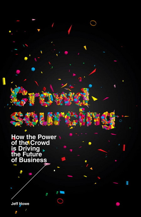
This poster looks awesome because of the typeface that the creator made. It's colourful and appealing to the eye. The text is made to almost be exploding into the background!

The typeface is in this poster is extreme. It's big, bold, and gritty. This is effective because those characteristics are part of modern trends in design right now.
Until next time,
- Sarah the Spectacular
No comments:
Post a Comment